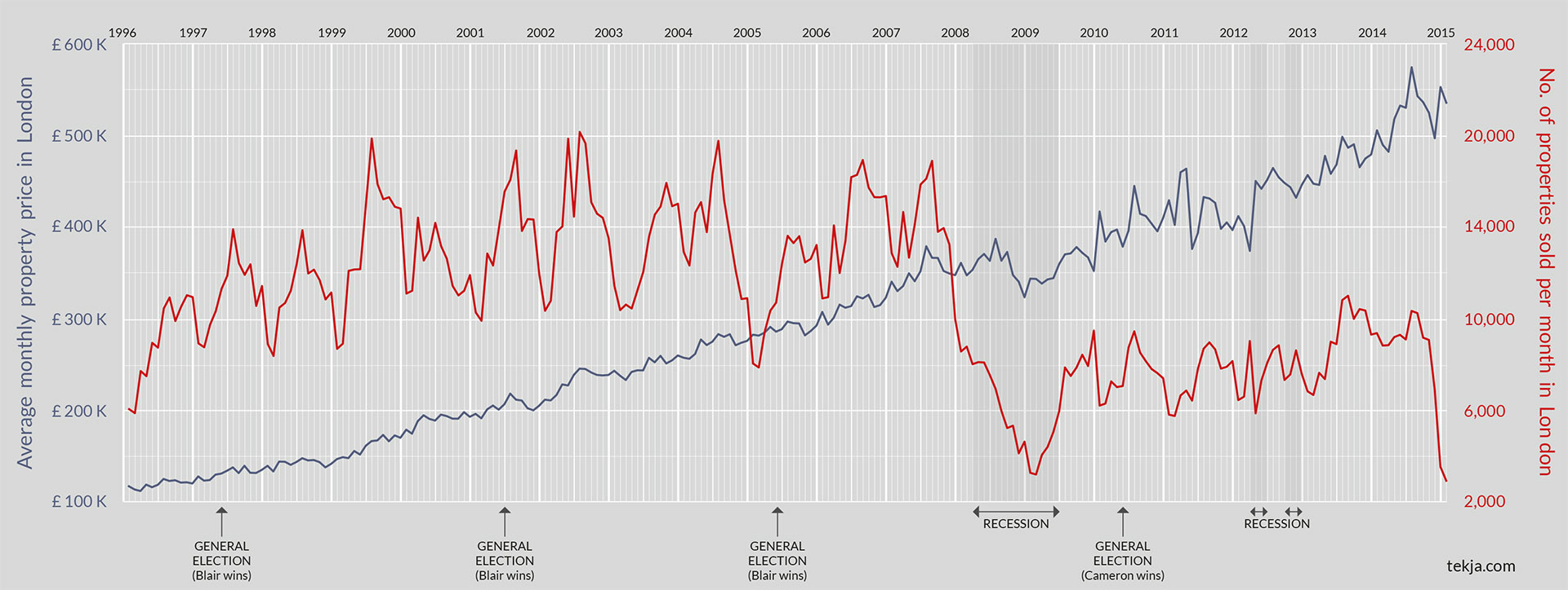
In 2014 house prices were rising towards a crisis point, but were they rising everywhere?
A roast chicken would cost £51 today if food prices had increased at the same rate as property since 1971. Instead, you can pick up a chicken and the rest of dinner for under £15 from most local supermarkets, so why the disparity?
Research from the Housing Forum, argues that this phenomenal price gap is due to a fundamental question of supply and demand, demand for housing simply has not been met with an increase in supply. Their recent report, led by senior practitioners in the housing field, rang out an alarmingly clear warning about the impact of the UK housing shortage.
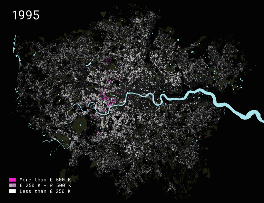
Following on from our work with the Housing Forum, we created this map to understand if the alarming reports that house prices were spiralling out of control were true, and if so, was this happening everywhere?
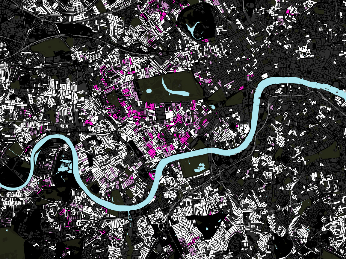
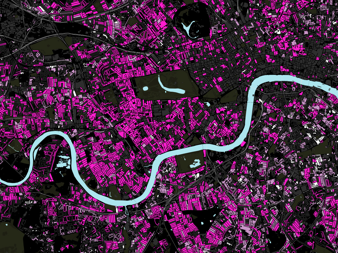
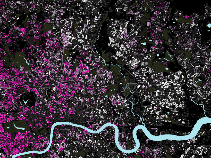
This interactive map uses Land Registry data and is coloured to show average house price for each block where a property was sold in London between 1995 and 2013.
The data was cut into increments that reflect stamp duty thresholds, represented by shades of pink, to show properties sold for under £250,000 between £250,000 and £500,000 and above £500,000.